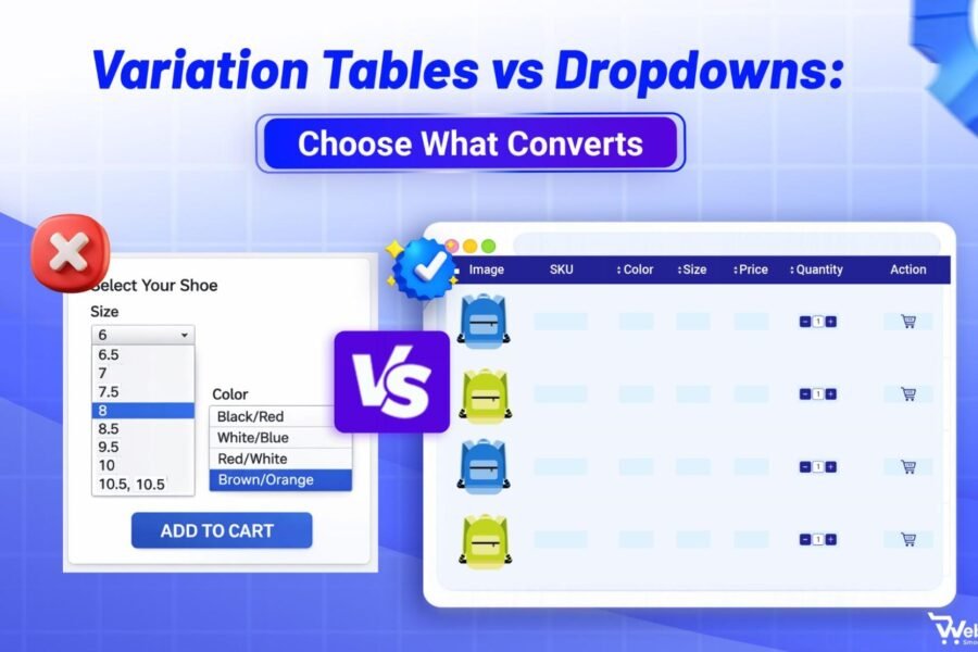
Designing Product Variation Tables is essential for helping online shoppers compare options, select the right product quickly, and boost conversions. A clear variation table design reduces confusion and cart abandonment.
Many shoppers struggle with poorly organized variation tables that confuse rather than clarify. They can’t find their size, don’t understand the price differences, or simply get overwhelmed by cluttered information. This frustration leads to hesitation, and hesitation leads to lost revenue.
We’ve analyzed hundreds of high-converting product pages and identified the design patterns that consistently turn browsers into buyers. The difference between a good and great variation table isn’t just aesthetics, it’s about psychology and user experience. When customers can instantly scan options, compare differences, and make confident decisions without second-guessing, your add-to-cart rates soar. The best variation tables don’t just display information; they guide shoppers toward their perfect choice while eliminating friction at every step.
In this guide, we’ll walk you through proven best practices for designing product variation tables that make selection effortless and drive conversions.
Why Designing Product Variation Tables Boosts Conversions
A strong Product Variation Table Design reduces friction and helps customers compare options quickly. These tables organize different versions of a product whether that’s color, size, material, or feature combinations, into a scannable format that helps customers compare options quickly.
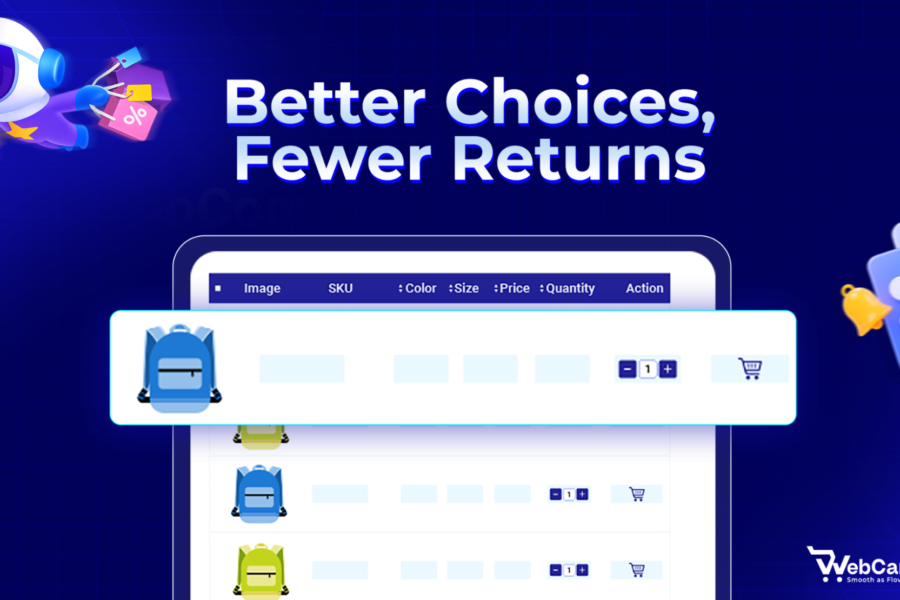
Research shows that 67% of shoppers abandon their carts due to confusion during the selection process. When customers can’t easily understand their options or identify the right variant, they leave. A thoughtfully designed variation table eliminates this friction by presenting choices in a logical, digestible way.The impact goes beyond just preventing abandonment. Clear variation tables reduce customer support inquiries, decrease return rates from incorrect selections, and increase average order value by making upsells and premium options more visible. Every element of your variation table, from column headers to mobile responsiveness, either builds confidence or creates doubt.
Best Practices for Product Variation Table Design
Here are the essential practices that separate high-performing tables from those that drive customers away.
Start With Mobile-first Design Thinking
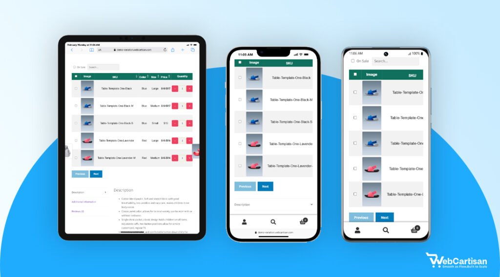
Over 60% of eCommerce traffic now comes from mobile devices, yet many variation tables still prioritize desktop layouts. This creates a frustrating experience for the majority of your potential customers. Mobile-first Product Variation Table Design ensures better usability across devices.
Design your variation tables for smaller screens first, then enhance for larger displays. This means using vertical stacking on mobile, making touch targets at least 44×44 pixels, and ensuring horizontal scrolling works smoothly when necessary.
Test your tables on actual devices, not just browser emulators. What looks perfect on your desktop can be frustrating on a real phone held in one hand. Pay special attention to thumb-reach zones, the most important actions should fall within the natural arc of a thumb swipe.
If customers need to zoom, pinch, or struggle to tap the right option, you’re losing sales before they even add items to their cart.
Consider using expandable rows or accordion-style sections to conserve vertical space while keeping all information accessible.Test your tables on actual devices, not just browser emulators. A table that looks functional in Chrome’s mobile view might perform poorly on a real iPhone or Android device with slower processing speeds or different touch behaviors.
Prioritize Visual Hierarchy with Clear Column Headers
Your variation table needs instantly recognizable structure. Customers should understand what each column represents within two seconds of viewing the table.
Use descriptive, benefit-focused headers rather than internal terminology. Instead of “SKU” or “Model,” use headers like “Size,” “Color,” “Material,” or “Features.” Bold these headers or use a contrasting background color to distinguish them from the data rows.
Keep the most important differentiator in the leftmost column (or top row on mobile). If size matters most for your product, that’s what customers should see first. Follow with price, then secondary attributes like color or material. This left-to-right priority matches natural reading patterns and helps customers scan efficiently.
Use Visual Cues Beyond Text Alone
Text-heavy variation tables require more cognitive effort to process. Adding visual elements speeds comprehension and makes selection more intuitive.
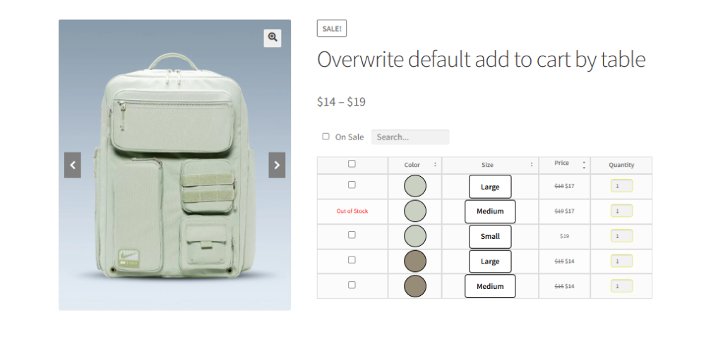
Incorporate color swatches for color variations, texture thumbnails for materials, or small icons to represent features. These visual anchors help customers process information faster and reduce the mental load of reading through text descriptions.
For size variations, consider adding simple silhouettes or measurements overlaid on product images. This gives customers immediate context about proportions without forcing them to reference a separate size chart. Visual representations of dimensions work particularly well for furniture, clothing, or any product where physical size significantly impacts the purchase decision.
Implement Smart Sorting And Filtering Options
As your product variations grow, customers need ways to narrow down options quickly. Static tables work for five variations but become overwhelming at fifteen or more.
Add filter options above your variation table that let customers hide irrelevant choices. If someone knows they need a large blue shirt, they should be able to filter out all other sizes and colors instantly. This reduces cognitive overload and speeds the path to purchase.
Default sorting should match customer priorities. For most products, this means sorting by popularity or price (low to high).
However, don’t assume one-size-fits-all. Luxury brands might sort by “newest” or “featured” to highlight premium options first, while clearance sections benefit from “highest discount” sorting. Consider your customer’s mindset when they land on your page are they bargain hunting, seeking the best-seller, or looking for something new?
Your default sort order is a silent salesperson that either guides customers toward what they want or forces them to work harder to find it. Test different default sorts and monitor which ones lead to higher add-to-cart rates for your specific audience.
However, fashion items might benefit from color-based sorting, while technical products might prioritize feature sets. Use analytics data to understand which variations sell most frequently, then surface those options first.
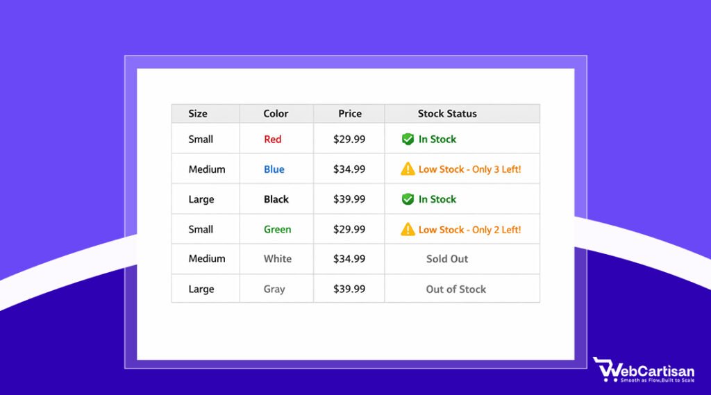
Highlight Availability And Stock Levels Strategically
Nothing frustrates customers more than selecting a variation only to discover it’s out of stock. Build transparency into your variation tables from the start.
Show availability status directly in the table using clear visual indicators: With green checkmarks for in-stock items, yellow warnings for low stock, and grayed-out rows for unavailable options. This prevents the disappointment of falling in love with an option that isn’t available.
When items are temporarily out of stock, offer “notify me” options directly in the variation table. This captures interest even when you can’t fulfill the order immediately and gives you valuable data about demand for specific variations. Some high-converting stores even show estimated restock dates when that information is available.
Make Pricing Transparent And Comparative
Price confusion kills conversions faster than almost any other factor. Customers need to understand exactly what they’re paying and why different variations cost different amounts. Clear pricing is essential in Product Variation Table Design because confusion kills conversions.
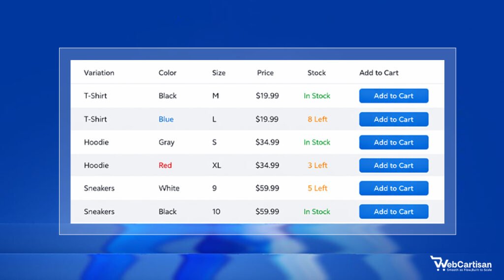
Display prices for each variation directly in the table rather than updating a single price field. This lets customers compare costs at a glance and understand the value proposition of premium options. If certain variations offer better value, highlight this with labels like “Best Value” or “Most Popular.”
When variations have different prices, consider adding a “Price Difference” column that shows the cost relative to the base option. A customer might hesitate at an $89 premium variation but feel comfortable with one marked “+$15 vs Standard.” This framing makes price increases feel more reasonable and helps justify the additional cost.
Optimize For Quick Scanning With Smart Formatting
The human brain processes visual patterns before reading text. Use this to your advantage by creating consistent, predictable formatting throughout your variation table.
Alternate row colors with subtle backgrounds of light gray on white work well to help eyes track across rows without losing place. Maintain consistent spacing between rows and columns. Crowded tables with minimal whitespace create visual stress and slow down decision-making.
Align numbers right and text left within columns. This small detail makes numerical comparisons easier since digits line up vertically by place value. Keep related information grouped together and use subtle dividing lines to separate distinct attribute categories.
Add Contextual Information And Tooltips
Customers shouldn’t need to leave your variation table to understand what they’re choosing. Build helpful context directly into the interface.
Use tooltip icons next to technical terms or features that might need explanation. When a customer hovers over or taps the icon, a small popup provides clarification without cluttering the main table. This works particularly well for specs like thread count, material grades, or technical features that differentiate premium variations.
For size-dependent products, include a “Size Guide” link prominently near the table. Better yet, let customers access sizing information in a modal overlay that doesn’t require leaving the product page. The less navigation required to make a decision, the higher your conversion rate.
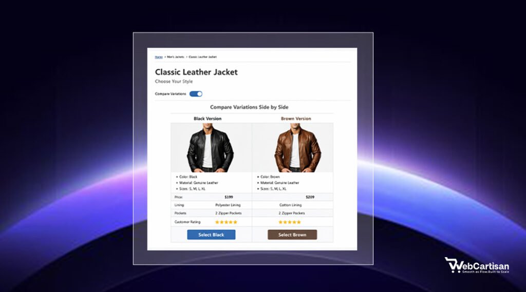
Enable Easy Comparison Between Variations
Customers often narrow their choice down to two or three variations but struggle with the final decision. Make comparison effortless.
Add checkboxes that let customers select multiple variations and view a side-by-side comparison. This focused view should strip away other options and highlight the specific differences between their shortlisted choices. Feature-by-feature comparison is especially valuable for products with complex specifications or multiple feature tiers.
Some high-converting stores place the “Add to Cart” button at the end of each row, allowing customers to add multiple variations in one session. This works well for consumable products where customers might buy several variations at once, or for businesses selling to resellers who order multiple SKUs.
Test And Iterate Based On Real User Behavior
The best practices for designing product variation tables aren’t one-size-fits-all. What works for apparel might fail for electronics, and what converts on desktop might confuse on mobile.
Implement heatmapping and session recording tools to watch how real customers interact with your variation tables. Look for patterns in hesitation, repeated clicks, or abandonment at specific points in the selection process. These behavioral signals reveal friction points that surveys and analytics alone might miss.
Run A/B tests on individual elements rather than redesigning entire tables at once. Test different column orders, color coding schemes, or filter implementations one at a time. Track metrics that matter: add-to-cart rate, time spent on variation selection, and completion rate for the entire purchase flow.
A variation table that looks cleaner might actually perform worse if it hides critical information customers need. Document your findings and build a testing roadmap – small, incremental improvements compound over time.
What works for one product category might fail for another, so segment your tests by product type, price point, and customer demographics to get actionable insights rather than misleading averages.
This isolates the impact of each change and builds a data-driven understanding of what resonates with your specific audience.
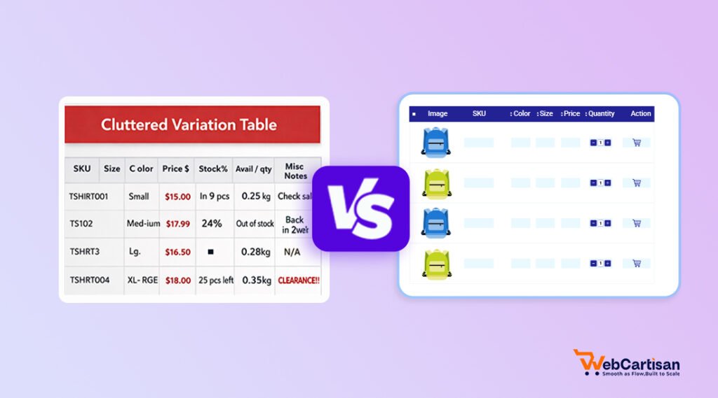
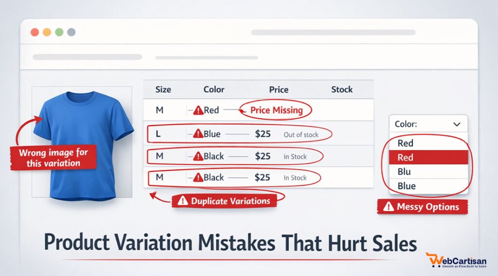
Common Product Variation Table Design Mistakes to Avoid
Even well-intentioned designs can sabotage conversions when they include these frequent missteps. We’ve seen these patterns repeatedly damage otherwise solid product pages. Poor Product Variation Table Design often leads to abandoned carts.
Don’t hide critical information behind additional clicks. If customers need to click each variation to see the price or view product images, you’re creating unnecessary friction. Display essential differentiators directly in the table.
Avoid overwhelming customers with too many columns. More than five or six columns creates cognitive overload and makes scanning difficult. If you have many attributes to display, consider grouping related features or using expandable sections for secondary details.
Never use vague or internal language in your tables. Terms like “SKU,” “Model Code,” or industry jargon confuse customers who just want to find the right size or color. Speak in customer-friendly language that describes benefits rather than technical specifications.
Don’t neglect loading speed for variation tables with many rows. Heavy tables with unoptimized images or inefficient code create frustrating delays, especially on mobile connections. Lazy loading, image compression, and efficient table rendering are essential for maintaining fast page speeds.
When to Use a Product Variation Table (And When Not To)
Product variation tables aren’t universal solutions. Use them strategically based on your product complexity and customer needs.
When to Use Variation Tables:
- Multiple attributes matter – Products with 3+ variables (size, color, material, price tiers)
- Price varies significantly – Different combinations have different costs customers need to compare
- Bulk or wholesale ordering – B2B customers selecting multiple variants at once
- Technical specifications – Electronics, furniture, or equipment where specs drive decisions
- Stock visibility is critical – Customers need to see availability across all options immediately
- Comparison shopping behavior – High-consideration purchases where buyers evaluate trade-offs
When NOT to Use Variation Tables:
- Simple products – Only 1-2 variations (standard dropdowns work better)
- Overwhelming options – 50+ combinations create decision paralysis
- Image-driven purchases – Fashion/lifestyle products where visuals matter more than specs
- Mobile-first audience – Complex tables frustrate mobile shoppers; use stepwise selection instead
- Personalized/custom products – Configuration tools serve better than static tables
- Single-variation products – No point displaying a table for color-only or size-only choices
The rule of thumb: If customers naturally compare multiple attributes simultaneously, use a table. If they select one attribute at a time, stick with traditional dropdowns or swatches.
For WordPress and WooCommerce sites, you can find hundreds of plugins, but we’ll suggest the best one: Variation Monster. Shopify users benefit from apps like Product Options, Customizer,and Infinite Options, which extend Shopify’s native variation handling.
These apps support complex variation structures, custom pricing rules, and enhanced visual presentation beyond default Shopify capabilities.
Standalone SaaS tools like Airtable or Google Sheets can power variation tables through API integration when you need maximum flexibility. This approach works well for businesses with frequently changing inventory or complex B2B pricing structures that benefit from spreadsheet-style management.
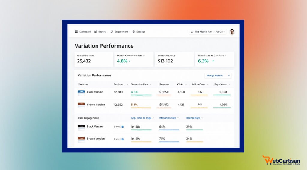
Measuring the Success of Your Product Variation Table Design
Measuring the performance of your Product Variation Table Design helps identify optimization opportunities. Focus on these metrics to understand whether your tables drive conversions or need refinement.
Monitor variation-specific conversion rates to identify which options perform best and which rarely sell. Low-performing variations might have poor positioning in your table, inadequate descriptions, or pricing that doesn’t align with perceived value.
Track time-on-page for product pages with variation tables. Customers should spend enough time to make informed decisions but shouldn’t linger indefinitely due to confusion. Sharp increases in time-on-page without corresponding conversion increases often signal usability problems.
Measure add-to-cart rates specifically for products with variation tables compared to single-option products. A significant gap suggests your table design needs work. Pay special attention to mobile versus desktop performance, as responsive design issues often manifest in these comparative metrics.
Final Thoughts
Product variation tables represent a critical conversion point where browsing customers become buyers or bounce to competitors. The difference between a confusing table and an intuitive one can mean thousands of dollars in monthly revenue.
Start with mobile-first design, prioritize visual hierarchy, and always test your assumptions with real user data. Remember that best practices for designing product variation tables evolve as customer expectations and device capabilities change. What worked last year might underperform today.
Investing in better Product Variation Table Design can significantly increase your store’s revenue. Review them quarterly, test new approaches, and stay current with emerging design patterns. Your variation tables work 24/7 as silent salespeople, and optimizing them pays dividends far beyond the initial effort.
Frequently Asked Questions
How Many Columns Should A Product Variation Table Have?
Most effective product variation tables contain three to six columns. This range provides enough information for informed decisions without overwhelming customers.
Should Product Variation Tables Show Out-Of-Stock Items?
Yes, display out-of-stock variations but clearly mark them as unavailable using visual indicators like grayed-out text or strikethrough styling. This prevents customer frustration and gives them complete visibility into all options. Consider adding “notify when available” functionality to capture interest in popular out-of-stock variations.
What’s The Best Way To Display Prices In Variation Tables?
Show prices for each variation directly in the table rather than using a single dynamically updating price field. This transparency lets customers compare costs at a glance and understand the value of premium options. Consider adding price difference indicators (like “+$15”) to help justify variations with higher costs.
How Do I Make Product Variation Tables Mobile-Friendly?
Design for mobile first by using vertical stacking, ensuring touch targets are at least 44×44 pixels, and enabling smooth horizontal scrolling when necessary. Consider using accordion-style expandable sections to conserve vertical space while keeping information accessible. Always test on actual mobile devices rather than relying solely on browser emulators.