The Gift Card Form Styling Panel allows you to fully customize the appearance of your gift card form elements using intuitive design settings. Below is a breakdown of the available sections and what each control does:
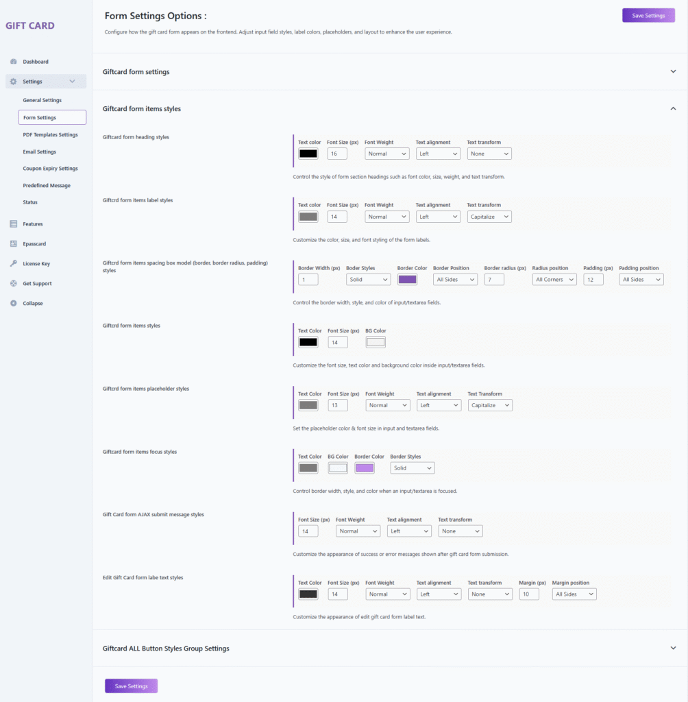
1. Giftcard Form Heading Styles
Configure the design of section headings such as “Sender Information” or “Recipient Details”.
Options
- Text Color — Defines the heading text color.
- Font Size (px) — Sets the heading font size (default: 16px).
- Font Weight — Controls heading thickness (normal, bold, etc.).
- Text Alignment — Aligns heading text (left, center, right).
- Text Transform — Modifies text casing (none, uppercase, lowercase, capitalize).
2. Giftcard Form Items Label Styles
Customize the labels displayed above each field (e.g., To, From, Message).
Options
- Text Color — Sets the label text color.
- Font Size (px) — Adjusts the label font size (default: 14px).
- Font Weight — Defines label thickness.
- Text Alignment — Positions the label (left, center, right).
- Text Transform — Changes casing (capitalize, none, uppercase, etc.).
3. Giftcard Form Items Spacing & Box Model Styles
Control the spacing, borders, and corner shapes of all input and textarea fields.
Options
- Border Width (px) — Specifies border thickness.
- Border Style — Selects border type (solid, dashed, etc.).
- Border Color — Sets the border color.
- Border Position — Applies borders to selected or all sides.
- Border Radius (px) — Rounds field corners.
- Radius Position — Specifies which corners are rounded.
- Padding (px) — Adds internal spacing within the field.
- Padding Position — Applies padding to selected or all sides.
4. Giftcard Form Items Styles
Adjust the general styling inside input and textarea fields.
Options
- Text Color — Defines the text color in input fields.
- Font Size (px) — Sets the field text size.
- Background Color — Applies background color to input fields.
5. Giftcard Form Items Placeholder Styles
Style the placeholder text shown inside input/textarea fields.
Options
- Text Color — Configures placeholder text color.
- Font Size (px) — Sets placeholder size (default: 13px).
- Font Weight — Defines placeholder thickness.
- Text Alignment — Aligns placeholder text.
- Text Transform — Adjusts casing (capitalize, none, etc.).
6. Giftcard Form Items Focus Styles
Modify the appearance of form fields when they are focused (clicked or active).
Options
- Text Color — Color of text during focus.
- Background Color — Background color on focus.
- Border Color — Border color when active.
- Border Style — Defines border type during focus.
7. Gift Card Form AJAX Submit Message Styles
Style the success or error messages displayed after AJAX form submission.
Options
- Font Size (px) — Sets message font size.
- Font Weight — Adjusts message text thickness.
- Text Alignment — Aligns the message (left/center/right).
- Text Transform — Modifies casing (uppercase, none, etc.).
8. Edit Gift Card Form Label Text Styles
Customize the labels displayed within the Edit Gift Card popup/form.
Options
- Text Color — Sets label text color.
- Font Size (px) — Defines label size.
- Font Weight — Controls label thickness.
- Text Alignment — Positions text (left, center, right).
- Text Transform — Modifies label casing.
- Margin (px) — Adds spacing around label elements.
- Margin Position — Applies margin to selected or all sides.
Giftcard All Button Styles
This section allows you to customize the appearance of all gift card-related buttons, including text styling, background, borders, padding, radius, and hover effects.
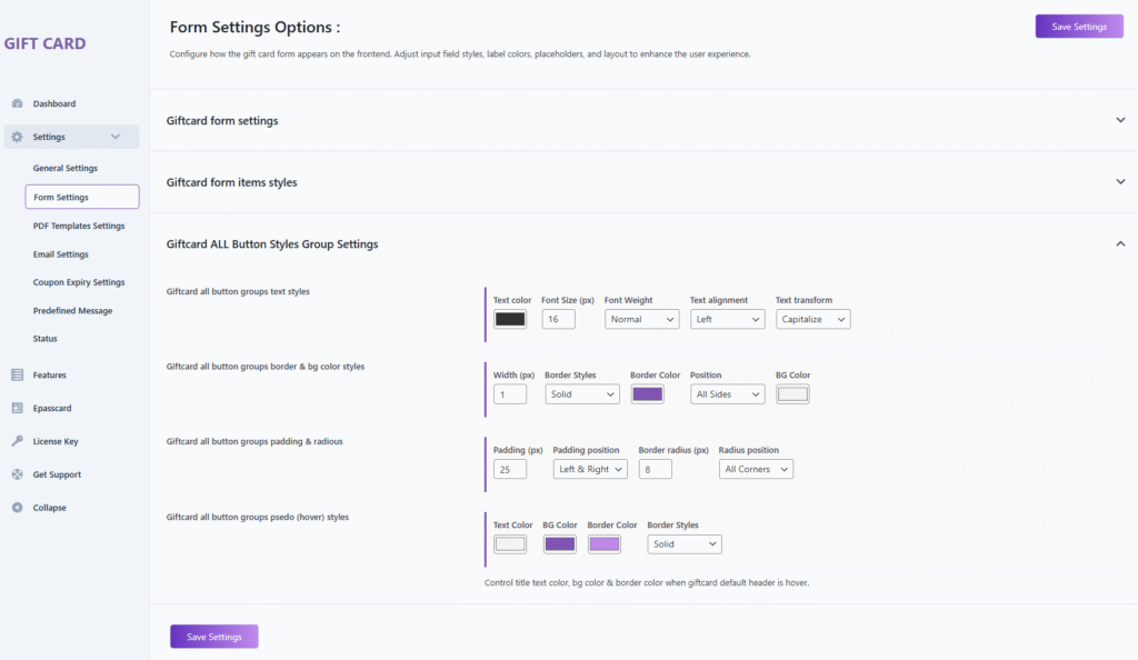
1. Giftcard All Button Groups Text Styles
Configure the typography and alignment of button text.
Options
- Text Color — Sets the color of the button text.
- Font Size (px) — Defines the button text size (default: 16px).
- Font Weight — Adjusts text thickness (normal, bold, etc.).
- Text Alignment — Aligns button text (left, center, right).
- Text Transform — Controls casing (capitalize, uppercase, lowercase, none).
2. Giftcard All Button Groups Border & Background Styles
Customize the border and background appearance of the buttons.
Options
- Width (px) — Sets the border thickness.
- Border Style — Select border type (solid, dashed, etc.).
- Border Color — Defines the color of the button border.
- Border Position — Apply borders to selected or all sides.
- Background Color — Set the background color of the button.
3. Giftcard All Button Groups Padding & Radius
Control button spacing and corner rounding.
Options
- Padding (px) — Sets inner spacing within the button (default: 25px).
- Padding Position — Apply padding to left & right or all sides.
- Border Radius (px) — Rounds button corners (default: 8px).
- Radius Position — Choose which corners receive radius.
4. Giftcard All Button Groups Pseudo (Hover) Styles
Configure button appearance when hovered by the user.
Options
- Text Color — Sets the text color on hover.
- Background Color — Defines the background color on hover.
- Border Color — Changes border color when hovered.
- Border Style — Sets the border style during hover (e.g., solid).
Description
Controls the text color, background color, and border styling when the gift card buttons are hovered, enhancing visual interactivity.


